The starting point of this project was an existing eReader that could be improved in terms of usability. The first user test with the original device showed that the target group, people who read for work, encounters problems with even the basic features of this eReader. The software architecture and layout have been redesigned and the results from a second user test showed that efficiency was increased by 38%! Moreover, all participants were able to find the main features of the device without any issues.
The project began with a thorough analysis of the usability of the original eReader. The analysis consisted of evaluations using Nielsen’s Heuristics and a user test with people from the target group. With its screen size of 9.7 inch the device aims at people that read for their profession; the screen size makes it suitable for reading digital documents such as reports and articles.
The results from the user test showed that the eReader was not efficient or effective. Participants even encountered issues with basic functions such as finding a document or annotating within a document. The layout of the screen, the visual language of the icons and the system architecture appeared to be the main problems. These elements have been redesigned to create a clear hierarchy both in the layout as in the system.
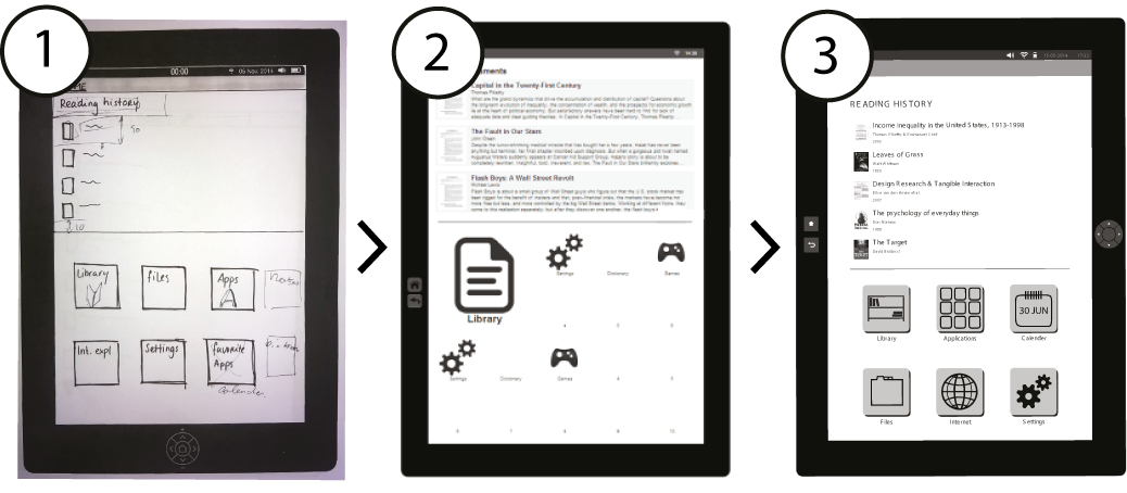
The sketches of the interface and the system hierarchy have been translated into dynamic webpages using Axure RP. This prototype has been tested in a second user test, with new participants, to indicate to what extent the redesign improved the usability with regards to the original device.
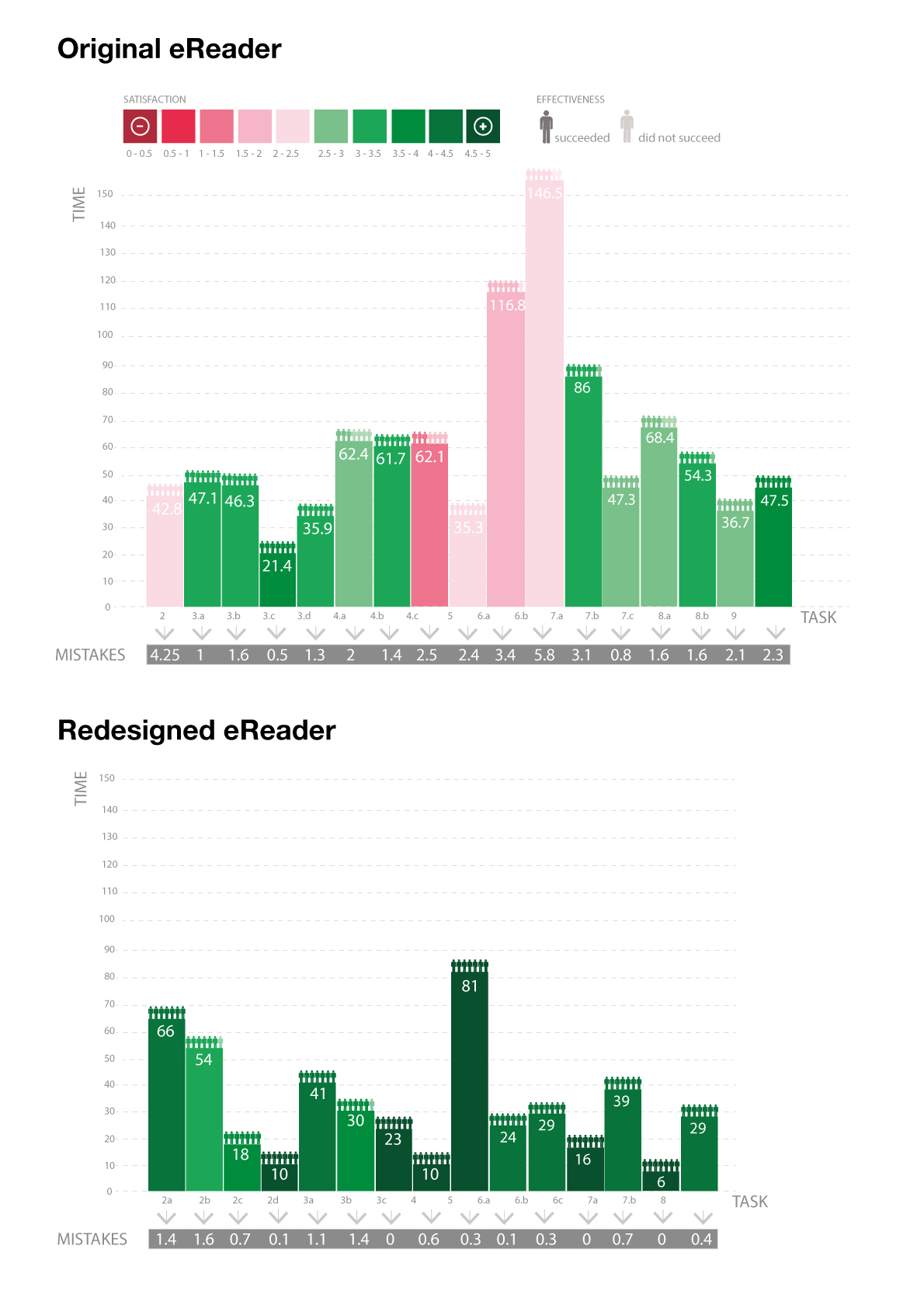
The chart above shows the raw results of both user tests. The color of a bar indicates user satisfaction: the greener the better. The height of a bar represents time needed to complete task: the shorter the better. These results demonstrate that the both the satisfaction as the efficiency have greatly improved with the redesign. The icons of people on top of the bar show that the effectiveness also has increased. Participants were able to finish nearly every task of the test.
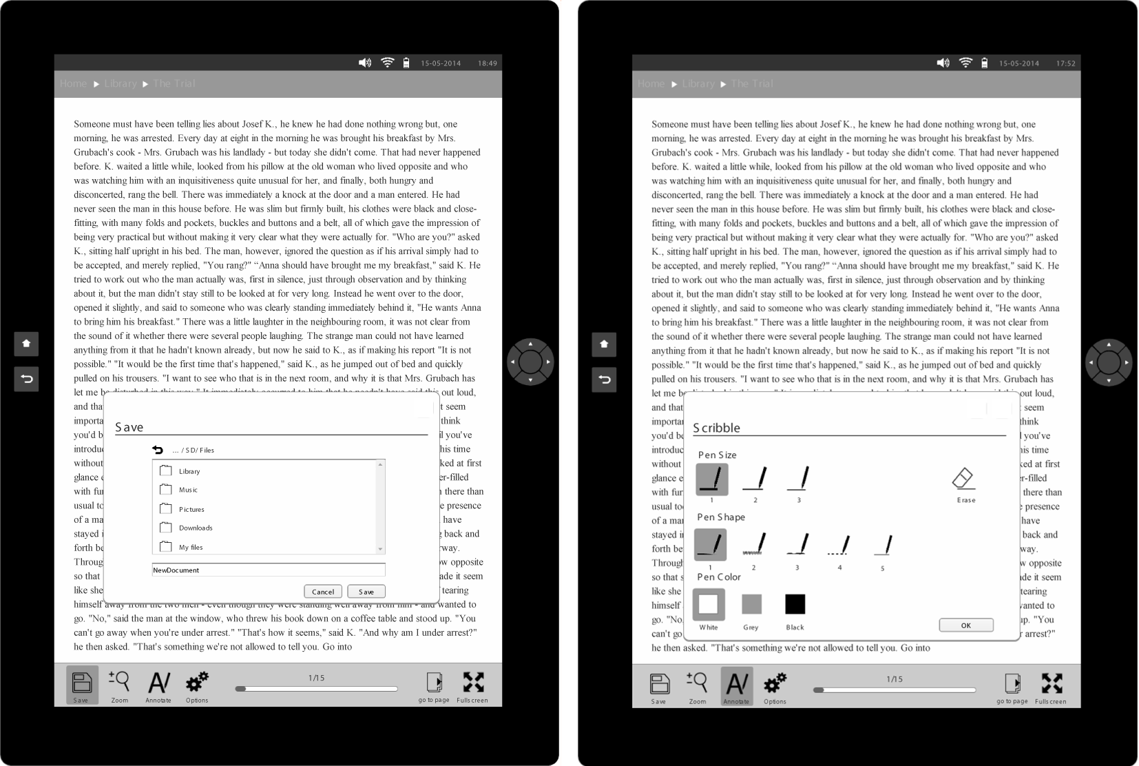
Above are some example screenshots of the redesigned interface. Below a movie of the interaction with the interface.